If there’s one thing I’ve learned by going into statistics as a career, it’s that it’s so easy to “lie” with data. Visualizations are one of the easiest ways to get away with doing this and tell a story that in all actuality may not be true at all.
Edward Tufte was a statistician and artist, and he was acutely aware of this problem too. He’s known for writing books such as The Visual Display of Quantitative Information, which is a classic regarding how to create statistical visualization. In the book, he discusses four principles:
- Don’t lie, distort the data, or mislead the reader
- Provide a clean graphic and avoid unnecessary non-data ink
- Create graphics that showcase complex ideas and patterns (related to data density) with encouragement of multiple graphics in 1.
- Make it pretty
For today’s post I’m going to focus on the first principle.
Don’t lie, distort the data, or mislead the reader
To create ethical visualizations, the data needs to be presented in a fair way. That is, the representation of numbers, as physically measured on the surface of the graphic itself, should be directly proportional to the number of quantities represented.
Tufte mathematically represented this idea with an equation called the Lie Factor. The Lie Factor is the size of the effect shown in a graphic divided by the size of the effect in the data. Values over 1 overstate the effect.
Now all that may sound intimidating, but with a few pictures hopefully the idea will be clearer.
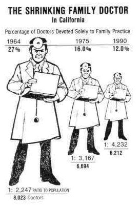
Below is a graphic that shows this in action:

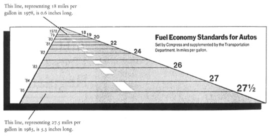
Notice the doctor’s width and height changes, which causes readers to be misled and think that the effect is much larger. In this visual, the lie factor is around 2.8. Here is another (what I consider more egregious) example:

Notice that the width difference highly distorts the actual change relative to the improvement that was seen. A 53% change looks much larger due to the drastically different size in the length of fuel effiency. If one looks solely at the lengths, it shows a 783% improvement!
How To Avoid This?
For both of these examples, if the effects were shown with a basic bar chart, the effect would not be distorted like this example. Clear labeling would also have helped these visuals to be more easily interpretable. For example, if we made a bar chart of the doctor example, label your y-axis with 0 as the starting point, plot the bars at the appropriate value for the value each doctor had in that year, and then keep the bar widths all the same. That alone would make the visual more accurate.
In general, be suspicious when graphs don’t start their y-value at 0 in something like bar graphs. Without having that frame of reference in a visual, the effect of a change will appear far larger than it actually is.
Conclusion
Of course, this is just one of many examples where data is used in a manipulative way to encourage a misleading response. One has to be vigilant to make sure that they’re getting the truth. When in doubt, it’s always wise to investigate the source further.